Pixel

Rolling Out Our Brand

Aug 13, 2019

As we officially launch the Vertical platform this month, we wanted to give some background on where it started and where it’s going.  The name is new, but this is an effort that started taking shape in early 2018.

After the founding members cast the vision for the product, the next step was to bring it to life with a functioning prototype. In order to do that, we needed to attach a name that would bring meaning quickly.


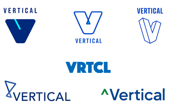
Coming out of the gate, that name was Skyrise Pro.

It was a straightforward approach combining the literal aspect of bricks and mortar with an enterprisey add on nodding toward software. In the end it worked well for that “finding our way” phase. However as we quickly gained traction we realized the need for a more scalable brand.

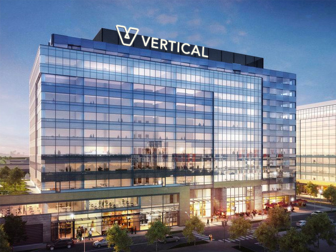
After cycling through many potential names combining industry + finance lingo, nothing was sticking. And then inspiration struck when we weren’t looking for it. The word vertical jumped out while resonating on many levels. Growth, progress, movement, upward, focus… all the positive connotations of the word aligned with our goal to impact the construction industry.

Early explorations of design for the Vertical identity
After kicking around a number of concepts for what the word vertical could look like as a brand, we gravitated toward Jenine’s approach which was affectionately known as “the pretzel”. It felt structural, stable, simple, while also using the literal V in the name.
Playing with color, gradient, fill, etc. once we narrowed down the concept
In the end we went with the outline of the symbol and used a gradient to give it a feeling of movement and uniqueness. The outline also happens to make an infinite loop, something that ties in with the fact that the financial processes we’re solving happen over and over again month after month.
The color mark shines with its blue to blue fade, while the monochrome white or black version stands strong when necessary. A horizontal version of the logo also came easily as it will be used as the primary mark on all of the web and mobile interfaces.
Finally, we planned for all of the future needs we would have as a business in terms of collateral, advertising, co-branding and scaling to multiple products.
Yes, physical cards are still necessary in the world of construction
Translating the logo into a mobile app icon
So much swag to be had – internally and in the field

Vertical HQ 2030?